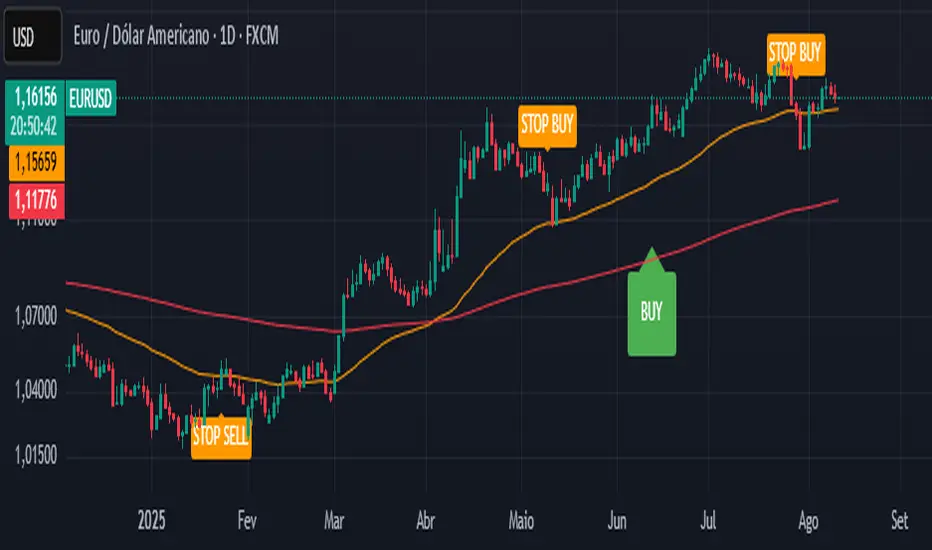
CTA-min D1 — Donchian 55/20 Trend Breakout (ATR Risk)What it is
A clean, daily trend-following breakout inspired by classic CTA/Turtle logic. It buys strength and sells weakness, then lets winners run with a channel-based trailing stop. No curve-fitting, no clutter—just rules.
How it trades
Timeframe: Daily (D1)
Entry: Close breaks the previous 55-bar Donchian channel (above for longs, below for shorts).
Exit/Trail: Trailing stop at the 20-bar Donchian channel on the opposite side (no fixed TP).
Risk: Initial stop = ATR(N) × stopMult (ATR is smoothed). Position size risks riskPct% of equity based on stop distance.
Labels: “BUY/SELL” only on the entry bar; “STOP BUY/STOP SELL” only on the exit bar.
Pyramiding: Off (one position at a time).
Regime Alignment with EMAs (recommended filter, not enforced by code)
Add EMA 50 and EMA 200 to the D1 chart.
Long bias: take BUY signals only when EMA50 > EMA200 (bullish regime).
Short bias: take SELL signals only when EMA50 < EMA200 (bearish regime).
Optional: for extra selectivity, require the H4 EMAs (50/200) to align with D1 before acting on a signal.
Inputs
entryN (55), exitN (20), atrLen (20), atrSmooth (10), stopMult (2.0), riskPct (0.5%–1.0% recommended).
Works well on (tested by user)
BTCUSD (Bitcoin), EURUSD, GBPJPY, NAS100/US100, USDJPY, AUDUSD, XAGUSD (Silver), US30 (Dow), JP225 (Nikkei), EURGBP, NZDUSD, EURCHF, USDCHF.
How to use
Apply to D1 charts. Review once per day after the daily close and execute next session open to mirror backtest assumptions. Best used as a portfolio strategy across multiple uncorrelated markets. Use the EMA alignment above as a discretionary regime filter to reduce false breakouts.
Notes
For educational use. Markets involve risk; past performance does not guarantee future results. Use responsible position sizing.
"Buy sell"に関するスクリプトを検索
ADX Phantom SniperADX Phantom Sniper is a precision trend-following tool that combines three powerful forces:
1. ADX & DI Crossover Trigger – Detects strong directional moves only when the trend strength exceeds a defined threshold.
2. Multi-Timeframe (MTF) Confirmation – Executes on the current chart timeframe (e.g., M15) only if the higher timeframe (H1) confirms the same trend direction.
3. Force Index Momentum Filter – Filters entries based on bullish/bearish momentum to avoid weak signals.
Signal Logic:
BUY: EMA14 > EMA100, price above EMA14, +DI crosses above -DI, ADX > threshold, Stochastic crosses above signal line in the bullish zone (>50), MTF trend aligned, Force Index > 0 (optional).
SELL: EMA14 < EMA100, price below EMA14, -DI crosses above +DI, ADX > threshold, Stochastic crosses below signal line in the bearish zone (<50), MTF trend aligned, Force Index < 0 (optional).
Features:
Noise filtering with trend structure + higher timeframe alignment
On-chart BUY/SELL labels for easy signal spotting
Optional Force Index filter toggle
Adjustable ADX threshold, EMA lengths, Stochastic settings, and higher timeframe choice
Suitable for scalping and swing entries depending on timeframe
Recommended Setup:
Primary chart: M15
Higher timeframe confirmation: H1
Combine with your preferred risk management rules.
Disclaimer:
This tool is for educational purposes only and is not financial advice. Past performance does not guarantee future results. Use at your own risk.

Candlestick Pattern Buy/Sell signalsOverview
This indicator provides clear, non-repainting Buy and Sell arrows directly on your chart to help you easily spot high-probability reversal opportunities. It's designed to be a clean and simple visual tool for traders who want to make informed manual trading decisions without a cluttered screen.
The logic is based on an evolution of classic candlestick patterns, specifically adapted to find more frequent signals on the 1-Hour timeframe.
How Signals Are Generated
To ensure reliability and avoid false signals, every arrow is the result of a two-step confirmation process:
The Setup Candle: First, the indicator identifies a potential reversal pattern. This can be a "Flexible" Pin Bar (Hammer or Shooting Star) or a classic Engulfing pattern.
The Trigger Arrow: A BUY or SELL arrow will only be plotted on your chart after the next candle confirms the setup by breaking the high or low of the setup candle. This confirmation method ensures the signal has momentum behind it.
The Signal Logic
The indicator is looking for two main types of reversal patterns:
Flexible Pin Bars: The rules for Hammers and Shooting Stars have been loosened to catch more signals. The main wick must be at least 1.5 times the size of the candle's body, making it more adaptive to the 1-Hour chart.
Classic Engulfing Patterns: It identifies powerful Bullish and Bearish Engulfing patterns where one candle's body completely overtakes the body of the previous candle, signaling a strong shift in control.
How to Use This Indicator
This tool is designed to be a key part of your own trading system.
Add the indicator to your chart.
Set your chart's timeframe to 1-Hour.
When a green BUY arrow appears, it serves as a strong suggestion of a potential long entry.
When a red SELL arrow appears, it serves as a strong suggestion of a potential short entry.
Confirmation: a candle close above a buying signal (Long), and below selling signal (short)
for extra confluence use a moving average such a 50 or 100 EMA and or volume.
Only go long or buy above EMA, and sell or short below EMA
Important: This indicator should be used as a confirmation tool alongside your own analysis of market structure, support/resistance levels, and the overall trend. It is not a complete, standalone trading system.
Disclaimer: This indicator is for educational and informational purposes only and does not constitute financial advice. All trading involves risk.

MacD Alerts MACD Triggers (MTF) — Buy/Sell Alerts
What it is
A clean, multi-timeframe MACD indicator that gives you separate, ready-to-use alerts for:
• MACD Buy – MACD line crosses above the Signal line
• MACD Sell – MACD line crosses below the Signal line
It keeps the familiar MACD lines + histogram, adds optional 4-color histogram logic, and marks crossovers with green/red dots. Works on any symbol and any timeframe.
How signals are generated
• MACD = EMA(fast) − EMA(slow)
• Signal = SMA(MACD, length)
• Buy when crossover(MACD, Signal)
• Sell when crossunder(MACD, Signal)
• You can compute MACD on the chart timeframe or lock it to another timeframe (e.g., 1h MACD on a 4h chart).
Key features
• MTF engine: choose Use Current Chart Resolution or a custom timeframe.
• Separate alert conditions: publish two alerts (“MACD Buy” and “MACD Sell”)—ideal for different notifications or webhooks.
• Visuals: MACD/Signal lines, optional 4-color histogram (trend & above/below zero), and crossover dots.
• Heikin Ashi friendly: runs on whatever candle type your chart uses. (Tip below if you want “regular” candles while viewing HA.)
Settings (Inputs)
• Use Current Chart Resolution (on/off)
• Custom Timeframe (when the above is off)
• Show MACD & Signal / Show Histogram / Show Dots
• Color MACD on Signal Cross
• Use 4-color Histogram
• Lengths: Fast EMA (12), Slow EMA (26), Signal SMA (9)
How to set alerts (2 minutes)
1. Add the script to your chart.
2. Click ⏰ Alerts → + Create Alert.
3. Condition: choose this indicator → MACD Buy.
4. Options: Once per bar close (recommended).
5. Set your notification method (popup/email/webhook) → Create.
6. Repeat for MACD Sell.
Webhook tip: send JSON like
{"symbol":"{{ticker}}","time":"{{timenow}}","signal":"BUY","price":"{{close}}"}
(and “SELL” for the sell alert).
Good to know
• Symbol-agnostic: use it on crypto, stocks, indices—no symbol is hard-coded.
• Timeframe behavior: alerts are evaluated on bar close of the MACD timeframe you pick. Using a higher TF on a lower-TF chart is supported.
• Heikin Ashi note: if your chart uses HA, the calculations use HA by default. To force “regular” candles while viewing HA, tweak the code to use ticker.heikinashi() only when you want it.
• No repainting on close: crossover signals are confirmed at bar close; choose Once per bar close to avoid intra-bar noise.
Disclaimer
This is a tool, not advice. Test across timeframes/markets and combine with risk management (position sizing, SL/TP). Past performance ≠ future results.
KSL-Fullsystem🔥 KSL Indicator คืออะไร? ใช้งานยังไงให้แม่นยำสุดๆ?
KSL คืออินดิเคเตอร์อัจฉริยะที่ช่วยบอก “จุดเปลี่ยนสำคัญของราคา”
ไม่ใช่แค่ดูกราฟมั่ว ๆ แล้วเดาสุ่ม!
📌 จุดเด่นของ KSL คือ “กรอบสีเขียว/แดง”
เมื่อราคามีแรงซื้อหรือแรงขายรุนแรง KSL จะสร้าง กรอบสีเขียว (Buy) หรือ กรอบสีแดง (Sell) ขึ้นมาทันที เพื่อแสดงให้เห็นว่า "ตรงนี้แหละ! คือจุดที่ตลาดมีแรงจริง!"
แต่จำไว้...
อย่ารีบเข้าออเดอร์ทันที!
✅ วิธีใช้งานที่แม่นยำ (เข้าใจง่ายมาก!)
🔹 ขั้นที่ 1: รอให้เกิดสัญญาณ (กรอบขึ้น)
🔹 ขั้นที่ 2: รอราคาย่อ / ดีดกลับมา “แตะกรอบ”
🔹 ขั้นที่ 3: ถ้ามีแรงกลับตัว → เข้าออเดอร์!
📍 กรอบสีเขียว/แดง = โซนต้นทางของแรง
คือโซนที่มีโอกาสเกิดแรงซื้อหรือขายซ้ำอีกครั้ง
ทำให้การเข้าเทรดของคุณ “แม่นยำขึ้น ปลอดภัยขึ้น”
🕒 ใช้ได้ทุก Timeframe ตั้งแต่ M1 ถึง H4
TF ใช้ยังไง จุดเข้า SL TP
M1-M5 เทรดเร็ว จบไว รอแตะกรอบแล้วเข้า นอกกรอบนิดเดียว ตามเป้าส่วนตัว
M15-M30 เห็นแนวโน้มชัด รอรีเทสต์แล้วแท่งย้ำทิศ SL นอกกรอบ TP ตามจังหวะ
H1-H4 เทรนด์แรง เทรนด์ยาว รอกลับตัวจากกรอบ SL นอกกรอบ เหมาะกับสาย Swing
💡 สรุปเข้าใจง่าย ๆ
❌ ห้ามเทรดทันทีหลังเห็นสัญญาณ!
✅ ให้รอราคากลับมาแตะกรอบก่อน
เพราะ:
🔹 กรอบ = จุดเริ่มต้นของแรง (เหมือน Supply/Demand Zone)
🔹 การเข้าเมื่อราคาย้อนกลับมา จะลดความเสี่ยง “ไล่ราคา”
🔹 ช่วยให้ได้จุดเข้าแม่น + SL สั้น + RR ดีขึ้น
📲 อยากลองใช้ KSL Indicator?
ทักมาเลยครับ! ทีมงานพร้อมสอนการใช้งานแบบ Step-by-step
ให้คุณเทรดได้อย่างมั่นใจ ไม่ต้องเดาทิศตลาดอีกต่อไป!
📍 ติดต่อผ่านไลน์: @kslacademy
หรือคลิกเลย: 👉 lin.ee/s5tk5BF
🔥 What is the KSL Indicator? How to Use It Accurately Like a Pro?
KSL is a smart trading indicator that helps identify critical price turning points —
Forget guessing or relying on random chart patterns!
📌 Key Feature: Green/Red Zones
Whenever there’s strong buying or selling pressure, KSL immediately highlights a
Green Box (Buy Signal) or Red Box (Sell Signal) to show you:
“This is where the real momentum started!”
But here’s the catch…
Never enter a trade immediately after the signal!
✅ How to Use KSL for Maximum Accuracy
🔹 Step 1: Wait for a signal box to appear
🔹 Step 2: Wait for price to pull back and retest the box
🔹 Step 3: If there's a sign of reversal → Enter your trade!
📍 The Green/Red Box = Origin Zone of Momentum
It’s where buy/sell pressure may happen again,
giving you a high-probability entry point.
🕒 Works on All Timeframes (M1 to H4)
Timeframe Usage Strategy
M1–M5 Fast scalping: Wait for retest and enter. Keep SL just outside the box.
M15–M30 Clearer trend: Wait for retest + confirmation candle. SL outside box, TP based on trend.
H1–H4 Strong swing trades: Wait for reversal signal at the box. SL outside box. Best for longer moves.
💡 Quick Summary
❌ Don’t jump in right after the signal!
✅ Wait for price to retest the box first.
Why?
🔹 The box = origin of real momentum (like a supply/demand zone)
🔹 Retesting gives a safer entry with better risk/reward
🔹 Helps avoid chasing price and getting trapped
📲 Ready to try KSL Indicator?
Message us now! Our team will guide you step-by-step
so you can trade with confidence — no more second-guessing the market!
📍 LINE: @kslacademy
👉 Or click: lin.ee/s5tk5BF

Double Fractal Entry📘 Double Fractal Entry – Original Structure-Based Entry System
Double Fractal Entry is a proprietary indicator that uses dynamic fractal structure to generate actionable buy/sell signals, with automatic Stop-Loss and Take-Profit placement. Unlike classic fractal tools or ZigZag-based visuals, this script constructs real-time structural channels from price extremes and offers precise entry points based on breakout or rejection behavior.
It is designed for traders who want a clear, structured approach to trading price action — without repainting, lagging indicators, or built-in oscillators.
🧠 Core Logic
This script combines three custom-built modules:
1. Fractal Detection and Channel Construction
- Fractals are detected using a configurable number of left/right bars (sensitivity).
- Confirmed upper/lower fractals are connected into two continuous channels.
- These channels represent real-time structure zones that evolve with price.
2. Entry Signal Logic
You can choose between two signal types:
- Breakout Mode – Triggers when price breaks above the upper fractal structure (for buys) or below the lower one (for sells).
- Rebound Mode – Triggers when price approaches a fractal channel and then rejects it (forms a reversal setup).
Each signal includes:
- Entry arrow on the chart
- Horizontal entry line
- Stop-Loss and Take-Profit lines
3. SL/TP Calculation
Unlike tools that use ATR or fixed values, SL and TP are dynamically set using the fractal range — the distance between the most recent upper and lower fractals. This makes the risk model adaptive to market volatility and structure.
📊 Visuals on the Chart
- 🔺 Green/Red triangle markers = confirmed fractals
- 📈 Lime/Red channel lines = evolving upper/lower structure
- 🔵 Blue arrow = signal direction (buy/sell)
- 📉 SL/TP lines = dynamically drawn based on fractal spacing
- 🔁 Signal history = optional, toggleable for backtesting
⚙️ Settings and Customization
- Fractal sensitivity (bars left/right)
- Entry mode: Breakout or Rebound
- SL and TP multiplier (based on fractal range)
- Visibility settings (signal history, lines, colors, etc.)
💡 What Makes It Unique
This is not just a variation of standard fractals or a ZigZag wrapper.
Double Fractal Entry was built entirely from scratch and includes:
- ✅ A dual-channel system that shows the live market structure
- ✅ Entry signals based on price behavior around key zones
- ✅ Volatility-adaptive SL/TP levels for realistic trade management
- ✅ Clean, non-repainting logic for both manual and automated use
The goal is to simplify structure trading and provide precise, repeatable entries in any market condition.
🧪 Use Cases
- Breakout mode – Ideal for trend continuation and momentum entries
- Rebound mode – Great for reversals, pullbacks, and range-bound markets
- Can be used standalone or combined with volume/trend filters
⚠️ Disclaimer
This tool is intended for technical analysis and educational use. It does not predict future market direction and should be used with proper risk management and strategy confirmation.

Yuri Garcia Smart Money Strategy FULL (COMPLIANT)Yuri Garcia Smart Money Strategy FULL (Slope Divergence)
This script is not a mashup of random indicators. It is an original, coherent strategy that blends multiple institutional-grade tools to form a unified Smart Money trading system. Each component contributes to precise trade filtering, context, and confirmation — no element is decorative or redundant.
🔍 Strategy Logic: How It Works
This strategy integrates the following tools, each with a clearly defined role:
1. Volume Cluster Zones (Orange bands)
Identifies strong buy/sell areas using the highest volume nodes over a rolling window. These act as dynamic points of control where Smart Money is likely active.
2. HTF Zones (4H) (Purple band)
Defines institutional zones by using the 20-bar high/low on the 4-hour chart. These set the outer bounds for valid entries, ensuring alignment with larger market structure.
3. Wick Pullback Filter (Orange circle 🔶)
Detects exhaustion or absorption near zones. Used to confirm genuine rejection after liquidity sweeps or traps.
4. Cumulative Delta Confirmation (Red square 🟥)
Analyzes whether buyers or sellers are dominant using delta volume. Trades only trigger when volume confirms the intended direction.
5. Slope-Based Delta Divergence (Optional)
Detects hidden reversals between price and delta. This prevents late entries and provides early insight into potential trap reversals.
6. Liquidity Grab Detection (Blue diamond 🔷)
Marks smart money stop hunts — temporary price breaks beyond highs/lows, followed by reversal. Used as a confluence tool.
7. ATR-Based Dynamic Risk Control
The strategy uses ATR to calculate SL/TP dynamically. This allows position sizing to adjust to volatility, reducing overexposure in high-momentum conditions.
🎯 Entry Criteria
All the following conditions must be met:
✅ Price is inside a Volume Cluster Zone
✅ Price is within the HTF Institutional Zone
✅ Wick Pullback confirms reaction
✅ Delta confirms strength of buyers/sellers
✅ (Optional) Slope-based divergence signals hidden shift
✅ (Optional) Liquidity grab occurs
Only then will the strategy trigger an entry.
📈 Visual Legend (Symbols on Chart)
Symbol Description
🟣 Purple Zone HTF Support/Resistance zone (4H context)
🟠 Orange Zone Volume cluster from top 3 volume nodes
🔶 Orange Circle Wick Pullback confirmation
🟥 Red Square Delta Confirmation
🔷 Blue Diamond Liquidity Grab indicator
🔵 Blue X Price is inside HTF Zone
🔻 Red Triangle SHORT entry signal
🔺 Green Triangle LONG entry signal
These visuals make it easier to read the chart intuitively while understanding each condition’s role.
⚙️ Strategy Settings Justification
Default Qty: 2% of equity (sustainable risk)
RRR: 2.0 (adaptive to volatility)
ATR Multiplier: 2.0 for SL/TP
Commission: 0.1% used
Slippage: 2 points for realism
Minimum Trades for Testing: Designed to generate over 100 trades under normal backtest conditions
Dataset: Supports BTC, GOLD, Forex, Indices with realistic volatility and volume
These settings reflect a realistic use case for average retail traders and avoid overfitting or unrealistic returns.
📌 How to Use
Apply on 15-minute or 1-hour timeframe.
Wait for full alignment of all entry conditions.
Confirm visually or use included alerts for manual or bot execution.
SL and TP are automatically handled.
🚫 Important Notes
This script is original, not a remix or mashup of unrelated indicators.
Each component was designed to work in harmony, enhancing trade quality and confidence.
No external scripts are required to function.
Alert messages are pre-formatted for both manual and webhook use.

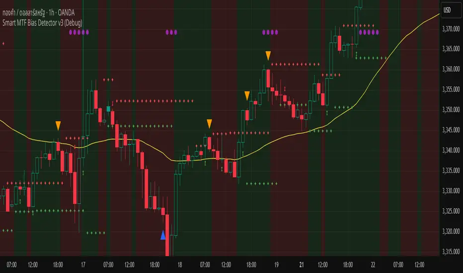
Smart MTF Bias Detector v3 (Debug)Here's a breakdown of the "Smart MTF Bias Detector v3 (Debug)" indicator's five main filters:
Main Trend (Multi-Timeframe Heikin Ashi)
The green/red background indicates the trend from Heikin Ashi candles on the H1 timeframe (or your set timeframe).
If the Heikin Ashi candle closes above its open, the background is green (indicating an upward bias).
If the Heikin Ashi candle closes below its open, the background is red (indicating a downward bias).
Short-Term Trend Filter (EMA50)
The yellow line represents the EMA50.
Buy only when the price closes above the EMA50.
Sell only when the price closes below the EMA50.
Abnormal Buy/Sell Pressure Detection (Volume Spike)
Purple dots signify candles where the volume is greater than the SMA (Simple Moving Average) of volume over N previous candles, multiplied by a specified multiplier.
This confirms there's "force" driving the price up or serious selling pressure.
Momentum Filter (Stochastic RSI)
Blue upward triangles and orange downward triangles indicate when %K crosses %D.
It uses Oversold/Overbought targets (20/80) to avoid crosses in the middle ranges.
Pivot Break (Fractal Breakout)
Red "X" marks represent Fractal Highs, and green "X" marks represent Fractal Lows.
Red/green up/down arrows indicate breakouts of these levels (e.g., a previous High being broken means an upward breakout, or a previous Low being broken means a downward breakout).
BUY Signal Conditions
A BUY signal will be generated when:
The background is green (HTF Trend ↑).
The Stoch RSI crosses up from below the Oversold zone (blue arrow).
A Fractal Low breakout occurs (Fract UP arrow).
The price is above the EMA50.
There is a Volume Spike (purple dot).
SELL Signal Conditions
A SELL signal will be generated when:
The background is red (HTF Trend ↓).
The Stoch RSI crosses down from above the Overbought zone (orange arrow).
A Fractal High breakout occurs (Fract DOWN arrow).
The price is below the EMA50.
There is a Volume Spike (purple dot).
Double Fractal Entry📘 Double Fractal Entry – Original Structure-Based Entry System
Double Fractal Entry is a proprietary indicator that uses dynamic fractal structure to generate actionable buy/sell signals, with automatic Stop-Loss and Take-Profit placement. Unlike classic fractal tools or ZigZag-based visuals, this script constructs real-time structural channels from price extremes and offers precise entry points based on breakout or rejection behavior.
It is designed for traders who want a clear, structured approach to trading price action — without repainting, lagging indicators, or built-in oscillators.
🧠 Core Logic
This script combines three custom-built modules:
1. Fractal Detection and Channel Construction
- Fractals are detected using a configurable number of left/right bars (sensitivity).
- Confirmed upper/lower fractals are connected into two continuous channels.
- These channels represent real-time structure zones that evolve with price.
2. Entry Signal Logic
You can choose between two signal types:
- Breakout Mode – Triggers when price breaks above the upper fractal structure (for buys) or below the lower one (for sells).
- Rebound Mode – Triggers when price approaches a fractal channel and then rejects it (forms a reversal setup).
Each signal includes:
- Entry arrow on the chart
- Horizontal entry line
- Stop-Loss and Take-Profit lines
3. SL/TP Calculation
Unlike tools that use ATR or fixed values, SL and TP are dynamically set using the fractal range — the distance between the most recent upper and lower fractals. This makes the risk model adaptive to market volatility and structure.
📊 Visuals on the Chart
- 🔺 Green/Red triangle markers = confirmed fractals
- 📈 Lime/Red channel lines = evolving upper/lower structure
- 🔵 Blue arrow = signal direction (buy/sell)
- 📉 SL/TP lines = dynamically drawn based on fractal spacing
- 🔁 Signal history = optional, toggleable for backtesting
⚙️ Settings and Customization
- Fractal sensitivity (bars left/right)
- Entry mode: Breakout or Rebound
- SL and TP multiplier (based on fractal range)
- Visibility settings (signal history, lines, colors, etc.)
💡 What Makes It Unique
This is not just a variation of standard fractals or a ZigZag wrapper.
Double Fractal Entry was built entirely from scratch and includes:
- ✅ A dual-channel system that shows the live market structure
- ✅ Entry signals based on price behavior around key zones
- ✅ Volatility-adaptive SL/TP levels for realistic trade management
- ✅ Clean, non-repainting logic for both manual and automated use
The goal is to simplify structure trading and provide precise, repeatable entries in any market condition.
🧪 Use Cases
- Breakout mode – Ideal for trend continuation and momentum entries
- Rebound mode – Great for reversals, pullbacks, and range-bound markets
- Can be used standalone or combined with volume/trend filters
🔒 Invite-Only Notice
This is an invite-only script with a fully closed source.
All logic is original and developed by the author. It does not use or copy public open-source scripts, built-in indicators (RSI, MA, etc.), or repainting tricks. The entire entry and risk system is based on custom structural logic built from real-time price action.
⚠️ Disclaimer
This tool is intended for technical analysis and educational use. It does not predict future market direction and should be used with proper risk management and strategy confirmation.
Master Trend Navigator/趋势大师导航仪[4H] by mrlazycat趋势大师导航仪使用说明
⚠ 非常重要,使用指标前请认真阅读这个使用说明
指标核心功能 本指标通过分析比特币的成交量、动能指标(MACD)、相对强弱指数(RSI)、趋势强度和成交量比率,生成在-1到1之间波动的趋势大师导航仪,帮助判断买卖时机。指标最佳适用场为4小时(4H)图表,适合1-2周的中短期交易。该趋势大师导航仪适用于 BTC,ETH, DOGE 等现货成交量大的虚拟货币
趋势曲线解读指南
① 市场状态(曲线颜色)
暗紫色:区间震荡市场 浅红色:弱多头趋势 深红色:强多头趋势 浅绿色:弱空头趋势 深绿色:强空头趋势
② 关键信号区域
红色区域(超买):趋势曲线 ≥ 0.6 时,可能出现回调风险
绿色区域(超卖):趋势曲线 ≤ -0.615 时,可能出现反弹机会
③ 锁定机制
在强多头趋势(深红色)和深绿色(强空头趋势)和部分弱趋势期间:
如果趋势曲线突破红色区域(超买)且市场趋势强度保持在强趋势或较强的弱趋势,趋势曲线会锁定在0.7附近(原始曲线以灰色继续)。
如果趋势曲线跌破绿色区域(超卖)且市场趋势强度保持在强趋势或较强的弱趋势,趋势曲线会锁定在-0.7附近(原始曲线以灰色继续)。 这表示趋势可能继续发展,建议等待锁定期结束后再进行操作。
✅ 极端多头趋势的特殊案例:(如ETH在2025年7月10日到20日,趋势曲线一直维持红色,意味着多头趋势不变。但这段时间ETH的趋势曲线曾跌到超卖区,因此曲线曾在底部锁定3个K线的时间,这意味着是多头右侧追多的机会。)
交易信号
① 超买超卖信号
红色区域(超买):趋势曲线 ≥ 0.6 时,可能出现回调风险
绿色区域(超卖):趋势曲线 ≤ -0.615 时,可能出现反弹机会
② 成交量爆发信号
顶部红色圆圈:代表成交量比率的爆发期,可能在当前或未来1-6根K线内出现阶段性高点。
底部黄色圆圈:代表成交量比率的潜在底部机会,可能在当前或未来1-6根K线内出现阶段性低点。
✅ 注意连续大量的顶部红色圆圈和底部黄色圆圈的出现,这意味着极端行情的出现。
③ 背离信号
顶背离(卖出信号):红色倒三角图标(标记为Bearish divergence\Sell)出现在趋势曲线顶部,当价格创新高但趋势曲线未创新高时触发,预示大幅回调风险。
底背离(买入信号):绿色正三角图标(标记为Bullish divergence\Buy)出现在趋势曲线底部,当价格创新低但趋势曲线未创新低时触发,预示底部反弹机会。
使用注意事项
① 交易所推荐:同时使用币安(Binance)和OKX的BTC/USDT现货数据(不同交易所的量能差异可能影响信号准确性)。
② 特殊行情优化:已针对2024-2025年比特币ETF上市后的低波动行情调整参数,未来将持续根据市场变化优化。
③ 强趋势操作提示:当趋势曲线锁定在超买或超卖区,应减少逆势操作。
④ 首次使用建议:观察历史行情以验证信号特征,震荡市捕捉反转点,趋势市识别延续信号。
最简单操作要诀
✅ 底部抄底组合:强空头趋势转弱空头 + 绿色超卖区 + 底背离绿色三角 + 底部黄色成交量圈
✅ 顶部逃顶组合:强多头趋势转弱多头趋势转换 + 红色超买区 + 顶背离红色三角 + 顶部红色成交量圈
✅ 趋势延续信号:趋势曲线锁定在 ±0.7 时,耐心等待锁定解除
推特联系:Jeffmo0769
Trend Master Navigator User Guide
⚠ Important: Please read this guide carefully before using the indicator
Core Functionality
This indicator analyzes Bitcoin's trading volume, MACD, RSI, trend strength, and volume ratio to generate the Trend Master Navigator, which oscillates between -1 and 1 to assist in buy/sell decisions. The indicator is best suited for 4-hour (4H) charts and is ideal for 1-2 week swing trading.The Trend Master Navigator is suitable for cryptocurrencies with high spot trading volumes, such as BTC , ETH , and DOGE .
Interpreting the Trend Curve
① Market States (Curve Colors)
Dark Purple: Range-bound market
Light Red: Weak bullish trend
Deep Red: Strong bullish trend
Light Green: Weak bearish trend
Deep Green: Strong bearish trend
② Key Signal Zones
Red Zone (Overbought): Trend curve ≥ 0.6 → Potential pullback risk
Green Zone (Oversold): Trend curve ≤ -0.615 → Potential rebound opportunity
③ Locking Mechanism
During strong bullish trends (deep red) and strong bearish trends (deep green), and partial weak trends:
If the trend curve breaks above the red zone (overbought) and market trend strength remains in a strong trend or robust weak trend, the trend curve will lock near 0.7 (original curve continues in gray).
If the trend curve breaks below the green zone (oversold) and market trend strength remains in a strong trend or robust weak trend, the trend curve will lock near -0.7 (original curve continues in gray).
This indicates that the trend may continue, and it is advisable to wait until the lock period ends before taking action.
✅ In the context of extreme bullish trends (e.g., ETH from July 10 to 20, 2025, where the trend curve remained red, indicating a persistent bullish trend), even though ETH's trend curve once dipped into the oversold zone, causing the curve to lock at the bottom for 3 K-line periods, this signifies a right-side buying opportunity during the bullish trend.
Trading Signals
① Overbought/Oversold Signals
Red Zone (Overbought): Trend curve ≥ 0.6 → Potential pullback risk
Green Zone (Oversold): Trend curve ≤ -0.615 → Potential rebound opportunity
② Volume Explosion Signals
Top Red Circle: Represents a volume ratio explosion period, possibly indicating a phase peak within the current or next 1-6 bars.
Bottom Yellow Circle: Represents a potential bottom opportunity in volume ratio, possibly indicating a phase trough within the current or next 1-6 bars.
✅ Pay attention to the continuous appearance of top red circles and bottom yellow circles, as this signals the emergence of extreme market conditions.
③ Divergence Signals
Bearish Divergence (Sell): Red inverted triangle icon (marked as Bearish divergence\Sell) appears at the trend curve top when the price makes a new high, but the trend curve does not; this indicates a significant pullback risk.
Bullish Divergence (Buy): Green upright triangle icon (marked as Bullish divergence\Buy) appears at the trend curve bottom when the price makes a new low, but the trend curve does not; this indicates a potential bottom rebound opportunity.
Other Usage Notes
① Exchange Recommendation: Use Binance and OKX BTC/USDT spot data simultaneously (volume discrepancies across different exchanges may affect signal accuracy).
② Special Market Optimization: Parameters have been adjusted for the low-volatility era following the Bitcoin ETF launch (2024-2025) and will continue to be optimized based on market changes.
③ Strong Trend Operation Tips: When the trend curve is locked in overbought or oversold zones, reduce counter-trend operations.
④ First Use Recommendation: Observe historical market trends to validate signal characteristics. Capture reversal points in range-bound markets and identify continuation signals in trending markets.
Simplest Trading Tactics
✅ Bottom Picking Setup: Transition from strong bearish trend to weak bearish + Green oversold zone + Bullish divergence green triangle + Bottom yellow volume circle
✅ Top Selling Setup: Transition from strong bullish trend to weak bullish trend + Red overbought zone + Bearish divergence red triangle + Top red volume circle
✅ Trend Continuation Signal: Trend curve locked at ±0.7 → Wait patiently for lock release
Contact on X: Jeffmo0769

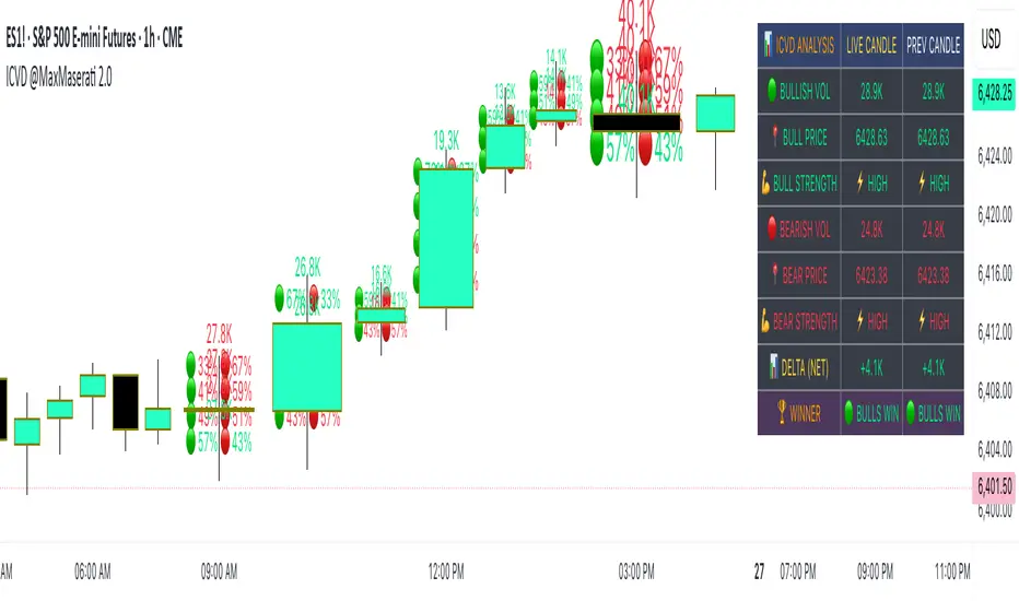
Intra Candle Volume Distribution @MaxMaserati2.0 INTRA CANDLE VOLUME DISTRIBUTION @MaxMaserati2.0
- Advanced Intra-Candle Distribution Mapping-
Discover the hidden volume dynamics within each candle! This revolutionary indicator analyzes buying vs selling pressure at multiple price levels INSIDE individual candles, revealing volume distribution patterns that traditional indicators completely miss.
✨ KEY FEATURES:
📊 Real-time volume distribution analysis at 4 price levels per candle
🎯 Smart detection - only shows significant volume concentrations
🏆 Winner-only mode for clean, directional signals
📈 Delta analysis showing net buying/selling pressure
📋 Comprehensive statistics table with live and historical data
🎨 Fully customizable colors, sizes, and display options
Selection to see the volume battle between buyer and sellers inside of the candle
Great, if you like to know the why's
🔍 WHAT MAKES IT UNIQUE:
- Advanced algorithms distribute volume across price levels within each candle
- Intelligent filtering eliminates noise, showing only significant volume zones
- Dynamic dot sizing based on volume intensity
- Real-time table comparing current vs previous candle metrics
- Multi-timeframe compatible (works on all timeframes)
- Professional-grade order flow analysis
📚 PERFECT FOR:
- Scalpers seeking precise entry/exit points
- Day traders validating breakouts and reversals
- Volume analysis specialists
- Order flow traders
- Institutional-style analysis on retail platforms
When only the winner (Strongest pressure) of the candle is selected
Better for fast decision making
When the delta is selected
Great to have clear idea of the net volume
🛠️ HOW TO USE:
Simply add to chart and customize to your preference. Green dots = bulls dominating that price level, red dots = bears dominating. Larger dots = higher volume intensity. Use the comprehensive table for detailed volume distribution analysis.
⚡ PERFORMANCE OPTIMIZED:
Efficient code ensures smooth operation without chart lag, even with maximum visual elements.
Support Resistance with Order BlocksIndicator Description
Professional Price Level Detection for Smart Trading. Master the Markets with Precision Support/Resistance and Order Block Analysis . It provides traders with clear visual cues for potential reversal and breakout areas, combining both retail and institutional trading concepts into one powerful tool.
The Support & Resistance with Order Blocks indicator is a versatile Pine Script tool designed to empower traders with clear, actionable insights into key market levels. By combining advanced pivot-based support and resistance (S/R) detection with order block (OB) filtering, this indicator delivers clean, high-probability zones for entries, exits, and reversals. With customizable display options (boxes or lines) and intuitive settings, it’s perfect for traders of all styles—whether you’re scalping, swing trading, or investing long-term. Overlay it on your TradingView chart and elevate your trading strategy today!
________________________________________
Key Features
✅ Dynamic Support/Resistance - Auto-adjusting levels based on price action
✅ Smart Order Block Detection - Identifies institutional buying/selling zones
✅ Dual Display Modes - Choose between Boxes or Clean Lines for different chart styles
✅ Customizable Sensitivity - Adjust detection parameters for different markets
✅ Broken Level Markers - Clearly shows when key levels are breached
✅ Timeframe-Adaptive - Automatically adjusts for daily/weekly charts
1. Dynamic Support & Resistance Detection
Identifies critical S/R zones using pivot high/low calculations with adjustable look back periods.
Visualizes active S/R zones with distinct colors and labels ("Support" or "Resistance" for boxes, lines for cleaner charts).
Marks broken S/R levels as "Br S" (broken support) or "Br R" (broken resistance) when historical display is enabled, aiding in breakout and reversal analysis.
2. Smart Order Block Identification
Detects bullish and bearish order blocks based on significant price movements (default: ±0.3% over 5 candles).
Highlights institutional buying/selling zones with customizable colors, displayed as boxes or lines.
Filters out overlapping OB zones to keep your chart clutter-free.
3. Dual Display Options
Boxes or Lines: Choose to display S/R and OB as boxes for detailed zones or lines for a minimalist view.
Line Width Customization: Adjust line widths for S/R and OB (1–5 pixels) for optimal visibility.
Color Customization: Tailor colors for active/broken S/R and bullish/bearish OB zones.
4. Advanced Overlap Filtering
Ensures S/R zones don’t overlap with OB zones or other S/R levels, providing only the most relevant levels.
Limits the number of active zones (default: 10) to maintain chart clarity.
5. Historical S/R Visualization
Optionally display broken S/R levels with distinct colors and labels ("Br S" or "Br R") to track historical price reactions.
Broken levels are dynamically updated and removed (or retained) based on user settings.
6. Timeframe Adaptability
Automatically adjusts pivot detection for daily/weekly timeframes (40-candle look back) versus shorter timeframes (20-candle look back).
Works seamlessly across all asset classes (stocks, forex, crypto, etc.) and timeframes.
________________________________________
How It Works
• Support & Resistance:
Uses ta.pivothigh and ta.pivotlow to detect significant price pivots, with a user-defined look back (default: 5 candles post-pivot).
Plots S/R as boxes (with labels "Support" or "Resistance") or lines, extending to the current bar for real-time relevance.
Broken S/R levels are marked with adjusted colors and labels ("S" or "R" for boxes, "Br S" or "Br R" for lines when historical display is enabled).
• Order Blocks:
Identifies OB based on strong price movements over 4 candles, plotted as boxes or lines at the candle’s midpoint.
Validates OB to prevent overlap, ensuring only significant zones are displayed.
Removes OB zones when price breaks through, keeping the chart focused on active levels.
• Customization:
Toggle S/R and OB visibility, adjust detection sensitivity, and set maximum active zones (4–50).
Fine-tune line widths and colors for a personalized chart experience.
________________________________________
Why Use This Indicator?
• Precision Trading: Pinpoint high-probability entry/exit zones with filtered S/R and OB levels.
• Clean Charts: Overlap filtering and zone limits reduce clutter, focusing on key levels.
• Versatile Display: Switch between boxes for detailed zones or lines for simplicity, with adjustable line widths.
• Institutional Edge: Leverage OB detection to align with institutional activity for smarter trades.
• User-Friendly: Intuitive settings and clear visuals make it accessible for beginners and pros alike.
________________________________________
Settings Overview________________________________________
⚙ Input Parameters
Settings Overview
Display Options:
Display Type: Choose "Boxes" or "Lines" for S/R and OB visualization.
S/R Line Width: Set line thickness for S/R lines (1–5 pixels, default: 2).
OB Line Width: Set line thickness for OB lines (1–5 pixels, default: 2).
Order Block Options:
Show Order Block: Enable/disable OB display.
Bull/Bear OB Colors: Customise border and fill colors for bullish and bearish OB zones.
Support/Resistance Options:
Show S/R: Toggle active S/R zones.
Show Historical S/R: Display broken S/R levels, marked as "Br S" or "Br R" for lines.
Detection Period: Set candle lookback for pivot detection (4–50, default: 5).
Max Active Zones: Limit active S/R and OB zones (4–50, default: 10).
Colors: Customise active and broken S/R colors for clear differentiation.
________________________________________
How to Use
1. Add to Chart: Apply the indicator to your TradingView chart.
2. Customize Settings:
o Select "Boxes" or "Lines" for your preferred display style.
o Adjust line widths, colors, and detection parameters to suit your trading style.
o Enable "Show Historical S/R" to track broken levels with "Br S" and "Br R" labels.
3. Analyze Levels:
o Use support zones (green) for buy entries and resistance zones (red) for sell entries.
o Monitor OB zones for institutional activity, signaling potential reversals or continuations.
o Watch for "Br S" or "Br R" labels to identify breakout opportunities.
4. Combine with Other Tools: Pair with trend indicators, volume analysis, or price action for a robust strategy.
5. Monitor Breakouts: Trade breakouts when price breaches S/R or OB zones, with historical labels providing context.
________________________________________
Example Use Cases
• Swing Trading: Use S/R and OB zones to identify entry/exit points, with historical broken levels for context.
• Breakout Trading: Trade price breaks through S/R or OB, using "Br S" and "Br R" labels to confirm reversals.
• Scalping: Adjust detection period for faster S/R and OB identification on lower timeframes.
________________________________________
• Performance: Optimized for all timeframes, with best results on 5M, 15M, 30M, 1H, 4H, or daily charts for swing trading.
• Compatibility: Works with any asset class and TradingView chart.
________________________________________
Get Started
Transform your trading with Support & Resistance with Order Blocks! Add it to your chart, customize it to your style, and trade with confidence. For questions or feedback, drop a comment on TradingView or message the author. Happy trading! 🚀
________________________________________
Disclaimer: This indicator is for educational and informational purposes only. Always conduct your own analysis and practice proper risk management before trading.

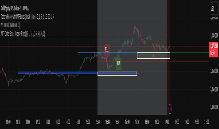
Pattern Finder with MTF Boxes (Break - Fixed)Script Title:
MTF Supply/Demand Zone Indicator with Candlestick Pattern Confirmation
Short Description:
This advanced strategy identifies key Supply and Demand zones (Order Blocks) on higher timeframes (30m & 1h) and then waits for a pullback to these zones on the current timeframe. The final entry signal is triggered upon the appearance of a valid candlestick pattern (e.g., Hammer, Engulfing) within these zones.
Full Description:
Introduction & Core Concept
This script is a powerful trading tool based on a combination of the following concepts:
Multi-Timeframe (MTF) Analysis: Identifying significant structures on higher timeframes to understand the bigger market picture.
Supply and Demand Zones: Finding areas where an imbalance between buyers and sellers has caused strong price movements.
Candlestick Patterns: Using classic candlestick patterns as the final confirmation for entering a trade at these key zones.
The main idea is to avoid trading blindly and instead wait for the price to react to a significant zone, then enter with a confirmation signal.
How the Strategy Works (Step-by-Step)
Identifying the Key Pattern on Higher Timeframes:
The script continuously monitors the 30-minute and 1-hour charts to find a specific pattern: a short consolidation period (usually 1-4 candles) immediately followed by a breakout with a powerful, high-momentum candle (Long Bar). This pattern indicates the formation of a fresh Supply or Demand Zone.
Drawing the Supply and Demand Boxes:
Green Box (Demand Zone): When a minor high is broken by a bullish Long Bar, this area is identified as potential support and marked with a green box.
Red Box (Supply Zone): When a minor low is broken by a bearish Long Bar, this area is identified as potential resistance and marked with a red box.
White Box (Long Bar / Trigger Zone): This box highlights the range of the Long Bar candle itself. A break of or return to this zone provides important signals.
Waiting for a Pullback:
After a zone is identified and drawn, the strategy waits for the price on your current chart to pull back into this box.
Entry Confirmation with Candlestick Patterns:
Once the price enters the box, the script looks for reversal candlestick patterns:
In a Demand Zone (Green Box): It looks for bullish patterns like the Hammer, Bullish Engulfing, Bullish Harami, and Morning Star. Upon detection, a BUY label appears on the chart.
In a Supply Zone (Red Box): It looks for bearish patterns like the Hanging Man, Shooting Star, Bearish Engulfing, Bearish Harami, and Evening Star. Upon detection, a SELL label appears.
Breakout Signal:
In addition to reversal signals, if the price breaks the White Box (Long Bar Zone) in the opposite direction, a breakout signal is generated, which could indicate a trend continuation.
Visual Elements on the Chart
Green/Red Boxes: The primary Supply and Demand zones from higher timeframes.
White Boxes: The range of the Long Bar candle that activated the primary zone.
BUY/SELL Labels: Trade signals that appear after a candlestick confirmation within the zones.
Moving Averages (SMA 100 & 200): Included to help identify the overall market trend. Trades aligned with the trend are generally more reliable.
Input Settings
period ATR & Bar multiplayer: Allow you to customize the definition of a "Long Bar" based on market volatility.
Number of candle for long bar avrage: The lookback period for calculating the average candle body size.
multiplayer for tp: A multiplier to calculate the take-profit based on the stop-loss size (Risk-to-Reward ratio).
How to Use This Strategy
Apply the script to your main trading timeframe (e.g., 5-minute or 15-minute).
Wait for a Supply (Red) or Demand (Green) zone to be drawn on your chart.
Be patient and wait for the price to return to this zone.
If a BUY or SELL label appears, consider it a valid entry signal.
Always combine these signals with your own analysis and the overall market context.
Disclaimer: This script is an analytical tool and should not be the sole basis for your trading decisions. Always practice proper risk management and thoroughly backtest its performance before using it in a live account.
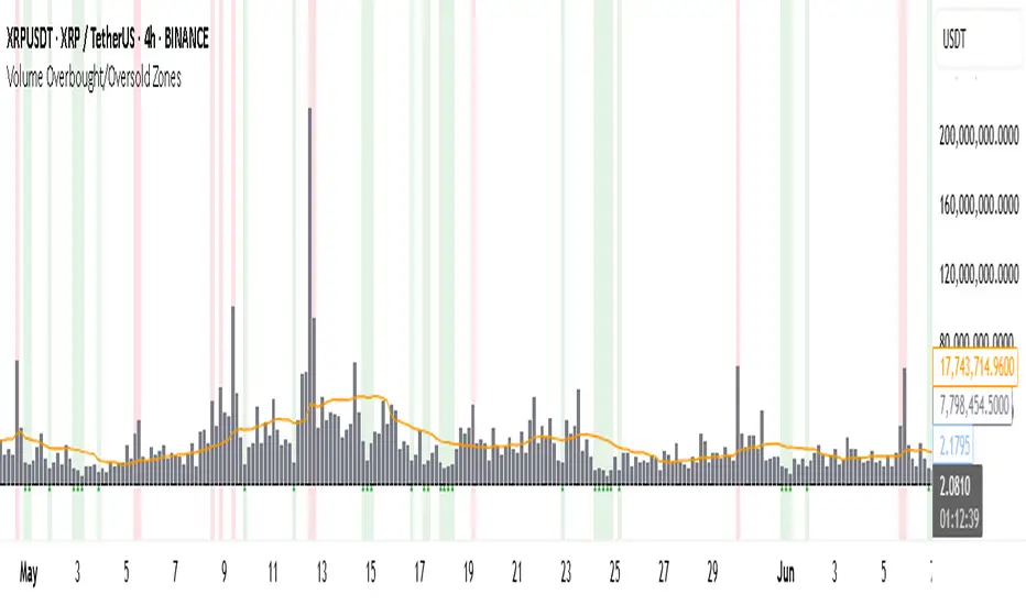
Volume Overbought/Oversold Zones📊 What You’ll See on the Chart
Red Background or Red Triangle ABOVE a Candle
🔺 Means: Overbought Volume
→ Volume on that bar is much higher than average (as defined by your settings).
→ Suggests strong activity, possible exhaustion in the trend or an emotional spike.
→ It’s a warning: consider watching for signs of reversal, especially if price is already stretched.
Green Background or Green Triangle BELOW a Candle
🔻 Means: Oversold Volume
→ Volume on that bar is much lower than normal.
→ Suggests the market may be losing momentum, or few sellers are left.
→ Could signal an upcoming reversal or recovery if confirmed by price action.
Orange Line Below the Candles (Volume Moving Average)
📈 Shows the "normal" average volume over the last X candles (default is 20).
→ Helps you visually compare each bar’s volume to the average.
Gray Columns (Actual Volume Bars)
📊 These are your regular volume bars — they rise and fall based on how active each candle is.
🔍 What This Indicator Does (In Simple Words)
This indicator looks at trading volume—which is how many shares/contracts were traded in a given period—and compares it to what's considered "normal" for recent history. When volume is unusually high or low, it highlights those moments on the chart.
It tells you:
• When volume is much higher than normal → market might be overheated or experiencing a buying/selling frenzy.
• When volume is much lower than normal → market might be quiet, potentially indicating lack of interest or indecision.
These conditions are marked visually, so you can instantly spot them.
💡 How It Helps You As a Trader
1. Spotting Exhaustion in Trends (Overbought Signals)
If a market is going up and suddenly volume spikes way above normal, it may mean:
• The move is getting crowded (lots of buyers are already in).
• A reversal or pullback could be near because smart money may be taking profits.
Trading idea: Wait for high-volume up bars, then look for price weakness to consider a short or exit.
2. Identifying Hidden Opportunities (Oversold Signals)
If price is falling but volume drops unusually low, it might mean:
• Panic is fading.
• Sellers are losing energy.
• A bounce or trend reversal could happen soon.
Trading idea: After a volume drop in a downtrend, watch for bullish price patterns or momentum shifts to consider a buy.
3. Confirming or Doubting Breakouts
Volume is critical for confirming breakouts:
• If price breaks a key level with strong volume, it's more likely to continue.
• A breakout without volume could be a fake-out.
This indicator highlights volume surges that can help you confirm such moves.
📈 How to Use It in Practice
• Combine it with candlestick patterns, support/resistance, or momentum indicators.
• Use the background colors or shapes as a visual cue to pause and analyze.
• Adjust the sensitivity to suit fast-moving markets (like crypto) or slow ones (like large-cap stocks).
Uptrick: Universal Z-Score ValuationOverview
The Uptrick: Universal Z-Score Valuation is a tool designed to help traders spot when the market might be overreacting—whether that’s on the upside or the downside. It does this by combining the Z-scores of multiple key indicators into a single average, letting you see how far the current market conditions have stretched away from “normal.” This average is shown as a smooth line, supported by color-coded visuals, signal markers, optional background highlights, and a live breakdown table that shows the contribution of each indicator in real time. The focus here is on spotting potential reversals, not following trends. The indicator works well across all timeframes and asset classes, from fast intraday charts like the 1-minute and 5-minute, to higher timeframes such as the 4-hour, daily, or even weekly. Its universal design makes it suitable for any market — whether you're trading crypto, stocks, forex, or commodities.
Introduction
To understand what this indicator does, let’s start with the idea of a Z-score. In simple terms, a Z-score tells you how far a number is from the average of its recent history, measured in standard deviations. If the price of an asset is two standard deviations above its mean, that means it’s statistically “rare” or extended. That doesn’t guarantee a reversal—but it suggests the move is unusual enough to pay attention.
This concept isn’t new, but what this indicator does differently is apply the Z-score to a wide set of market signals—not just price. It looks at momentum, volatility, volume, risk-adjusted performance, and even institutional price baselines. Each of those indicators is normalized using Z-scores, and then they’re combined into one average. This gives you a single, easy-to-read line that summarizes whether the entire market is behaving abnormally. Instead of reacting to one indicator, you’re reacting to a statistically balanced blend.
Purpose
The goal of this script is to catch turning points—places where the market may be topping out or bottoming after becoming overstretched. It’s built for traders who want to fade sharp moves rather than follow trends. Think of moments when price explodes upward and starts pulling away from every moving average, volume spikes, volatility rises, and RSI shoots up. This tool is meant to spot those situations—not just when price is stretched, but when multiple different indicators agree that something is overdone.
Originality and Uniqueness
Most indicators that use Z-scores only apply them to one thing—price, RSI, or maybe Bollinger Bands. This one is different because it treats each indicator as a contributor to the full picture. You decide which ones to include, and the script averages them out. This makes the tool flexible but also deeply informative.
It doesn’t rely on complex or hidden math. It uses basic Z-score formulas, applies them to well-known indicators, and shows you the result. What makes it unique is the way it brings those signals together—statistically, visually, and interactively—so you can see what’s happening in the moment with full transparency. It’s not trying to be flashy or predictive. It’s just showing you when things have gone too far, too fast.
Inputs and Parameters
This indicator includes a wide range of configurable inputs, allowing users to customize which components are included in the Z-score average, how each indicator is calculated, and how results are displayed visually. Below is a detailed explanation of each input:
General Settings
Z-Score Lookback (default: 100): Number of bars used to calculate the mean and standard deviation for Z-score normalization. Larger values smooth the Z-scores; smaller values make them more reactive.
Bar Color Mode (default: None): Determines how bars are visually colored. Options include: None: No candle coloring applied. - Heat: Smooth gradient based on the Z-score value. - Latest Signal: Applies a solid color based on the most recent buy or sell signal
Boolean - General
Plot Universal Valuation Line (default: true): If enabled, plots the average Z-score (zAvg) line in the separate pane.
Show Signals (default: true): Displays labels ("𝓤𝓹" for buy, "𝓓𝓸𝔀𝓷" for sell) when zAvg crosses above or below user-defined thresholds.
Show Z-Score Table (default: true): Displays a live table listing each enabled indicator's Z-score and the current average.
Select Indicators
These toggles enable or disable each indicator from contributing to the Z-score average:
Use VWAP Z-Score (default: true)
Use Sortino Z-Score (default: true)
Use ROC Z-Score (default: true)
Use Price Z-Score (default: true)
Use MACD Histogram Z-Score (default: false)
Use Bollinger %B Z-Score (default: false)
Use Stochastic K Z-Score (default: false)
Use Volume Z-Score (default: false)
Use ATR Z-Score (default: false)
Use RSI Z-Score (default: false)
Use Omega Z-Score (default: true)
Use Sharpe Z-Score (default: true)
Only enabled indicators are included in the average. This modular design allows traders to tailor the signal mix to their preferences.
Indicator Lengths
These inputs control how each individual indicator is calculated:
MACD Fast Length (default: 12)
MACD Slow Length (default: 26)
MACD Signal Length (default: 9)
Bollinger Basis Length (default: 20): Used to compute the Bollinger %B.
Bollinger Deviation Multiplier (default: 2.0): Standard deviation multiplier for the Bollinger Band calculation.
Stochastic Length (default: 14)
ATR Length (default: 14)
RSI Length (default: 14)
ROC Length (default: 10)
Zones
These thresholds define key signal levels for the Z-score average:
Neutral Line Level (default: 0): Baseline for the average Z-score.
Bullish Zone Level (default: -1): Optional intermediate zone suggesting early bullish conditions.
Bearish Zone Level (default: 1): Optional intermediate zone suggesting early bearish conditions.
Z = +2 Line Level (default: 2): Primary threshold for bearish signals.
Z = +3 Line Level (default: 3): Extreme bearish warning level.
Z = -2 Line Level (default: -2): Primary threshold for bullish signals.
Z = -3 Line Level (default: -3): Extreme bullish warning level.
These zone levels are used to generate signals, fill background shading, and draw horizontal lines for visual reference.
Why These Indicators Were Merged
Each indicator in this script was chosen for a specific reason. They all measure something different but complementary.
The VWAP Z-score helps you see when price has moved far from the volume-weighted average, often used by institutions.
Sortino Ratio Z-score focuses only on downside risk, which is often more relevant to traders than overall volatility.
ROC Z-score shows how fast price is changing—strong momentum may burn out quickly.
Price Z-score is the raw measure of how far current price has moved from its mean.
RSI Z-score shows whether momentum itself is stretched.
MACD Histogram Z-score captures shifts in trend strength and acceleration.
%B (Bollinger) Z-score indicates how close price is to the upper or lower volatility envelope.
Stochastic K Z-score gives a sense of how high or low price is relative to its recent range.
Volume Z-score shows when trading activity is unusually high or low.
ATR Z-score gives a read on volatility, showing if price movement is expanding or contracting.
Sharpe Z-score measures reward-to-risk performance, useful for evaluating trend quality.
Omega Z-score looks at the ratio of good returns to bad ones, offering a more nuanced view of efficiency.
By normalizing each of these using Z-scores and averaging only the ones you turn on, the script creates a flexible, balanced view of the market’s statistical stretch.
Calculations
The core formula is the standard Z-score:
Z = (current value - average) / standard deviation
Every indicator uses this formula after it’s calculated using your chosen settings. For example, RSI is first calculated as usual, then its Z-score is calculated over your selected lookback period. The script does this for every indicator you enable. Then it averages those Z-scores together to create a single value: zAvg. That value is plotted and used to generate visual cues, signals, table values, background color changes, and candle coloring.
Sequence
Each selected indicator is calculated using your custom input lengths.
The Z-score of each indicator is computed using the shared lookback period.
All active Z-scores are added up and averaged.
The resulting zAvg value is plotted as a line.
Signal conditions check if zAvg crosses user-defined thresholds (default: ±2).
If enabled, the script plots buy/sell signal labels at those crossover points.
The candle color is updated using your selected mode (heatmap or signal-based).
If extreme Z-scores are reached, background highlighting is applied.
A live table updates with each individual Z-score so you know what’s driving the signal.
Features
This script isn’t just about stats—it’s about making them usable in real time. Every feature has a clear reason to exist, and they’re all there to give you a better read on market conditions.
1. Universal Z-Score Line
This is your primary reference. It reflects the average Z-score across all selected indicators. The line updates live and is color-coded to show how far it is from neutral. The further it gets from 0, the brighter the color becomes—cyan for deeply oversold conditions, magenta for overbought. This gives you instant feedback on how statistically “hot” or “cold” the market is, without needing to read any numbers.
2. Signal Labels (“𝓤𝓹” and “𝓓𝓸𝔀𝓷”)
When the average Z-score drops below your lower bound, you’ll see a "𝓤𝓹" label below the bar, suggesting potential bullish reversal conditions. When it rises above the upper bound, a "𝓓𝓸𝔀𝓷" label is shown above the bar—indicating possible bearish exhaustion. These labels are visually clear and minimal so they don’t clutter your chart. They're based on clear crossover logic and do not repaint.
3. Real-Time Z-Score Table
The table shows each indicator's individual Z-score and the final average. It updates every bar, giving you a transparent breakdown of what’s happening under the hood. If the market is showing an extreme average score, this table helps you pinpoint which indicators are contributing the most—so you’re not just guessing where the pressure is coming from.
4. Bar Coloring Modes
You can choose from three modes:
None: Keeps your candles clean and untouched.
Heat: Applies a smooth gradient color based on Z-score intensity. As conditions become more extreme, candle color transitions from neutral to either cyan (bullish pressure) or magenta (bearish pressure).
Latest Signal: Applies hard coloring based on the most recent signal—greenish for a buy, purple for a sell. This mode is great for tracking market state at a glance without relying on a gradient.
Every part of the candle is colored—body, wick, and border—for full visibility.
5. Background Highlighting
When zAvg enters an extreme zone (typically above +2 or below -2), the background shifts color to reflect the market’s intensity. These changes aren’t overwhelming—they’re light fills that act as ambient warnings, helping you stay aware of when price might be reaching a tipping point.
6. Customizable Zone Lines and Fills
You can define what counts as neutral, overbought, and oversold using manual inputs. Horizontal lines show your thresholds, and shaded regions highlight the most extreme zones (+2 to +3 and -2 to -3). These lines give you visual structure to understand where price currently stands in relation to your personal reversal model.
7. Modular Indicator Control
You don’t have to use all the indicators. You can enable or disable any of the 12 with a simple checkbox. This means you can build your own “blend” of market context—maybe you only care about RSI, price, and volume. Or maybe you want everything on. The script adapts accordingly, only averaging what you select.
8. Fully Customizable Sensitivity and Lengths
You can adjust the Z-score lookback length globally (default 100), and tweak individual indicator lengths separately. This lets you tune the indicator’s responsiveness to suit your trading style—slower for longer swings, faster for scalping.
9. Clean Integration with Any Chart Layout
All visual elements are designed to be informative without taking over your chart. The coloring is soft but clear, the labels are readable without being huge, and you can turn off any feature you don’t need. The indicator can work as a full dashboard or as a simple line with a couple of alerts—it’s up to you.
10. Precise, Real-Time Signal Logic
The crossover logic for signals is exact and only fires when the Z-score moves across your defined boundary. No estimation, no delay. Everything is calculated based on current and previous bar data, and nothing repaints or back-adjusts.
Conclusion
The Universal Z-Score Valuation indicator is a tool for traders who want a clear, unbiased way to detect overextension. Instead of relying on a single signal, you get a composite of several market perspectives—momentum, volatility, volume, and more—all standardized into a single view. The script gives you the freedom to control the logic, the visuals, and the components. Whether you use it as a confirmation tool or a primary signal source, it’s designed to give you clarity when markets become chaotic.
Disclaimer
This indicator is for research and educational use only. It does not constitute financial advice or guarantees of performance. All trading involves risk, and users should test any strategy thoroughly before applying it to live markets. Use this tool at your own discretion.

Supply & Demand MTF[E7T]This is not your average supply and demand tool. it’s a powerful, flexible indicator that helps traders spot high-probability opportunities by adapting to real-time market conditions. It uses a smart combination of volatility (ATR), volume, and price action to identify key zones where the market is likely to react. Perfect for scalpers and swing traders alike, this strategy brings together adaptive zone detection, trend bias (pivot line), two-tiered signals (S1 and S2), volume filtering, built-in Fibonacci targets, and even a debug mode for transparency and performance tracking.
KEY FEATURES
1. ADAPTIVE ZONE DETECTION; This feature highlights areas where price is likely to bounce or reversebullish demand zones and bearish supply zones. Instead of using fixed levels, it adjusts based on market volatility.
HOW IT WORKS:
Uses Average True Range (ATR) to measure volatility.
TWO MODES:
Low Volatility Mode: Makes zones tighter for calm markets.
High Volatility Mode: Expands zones during choppy or fast-moving conditions.
Plots red boxes for supply zones and blue for demand zones. Zones extend until broken or naturally expire.
WHY IT MATTERS: Traditional zone indicators often fall short in fast-changing conditions. This one adjusts automatically, helping you stay one step ahead.
EXAMPLE: On a 4H BTCUSD chart, a demand zone will form at a key support level and adjust its size depending on whether the market is quiet or volatile.
2. MARKET BIAS PIVOT LINE; This dynamic line helps you quickly see whether the market is trending up or down so you can trade in the direction of strength.
HOW IT WORKS:
Based on recent swing highs and lows (default: last 4 bars).
Line is green when price is above (bullish), red when below (bearish).
Updates live and can be turned on/off in settings.
WHY IT MATTERS: It’s a built-in trend filter. Use it to avoid fighting the market.
EXAMPLE: If SPY is above a green pivot and enters a demand zone, it’s a solid bullish setup.
3. DUAL ENTRY SIGNALS (S1 and S2) The strategy gives you two signal types depending on your risk style:
S1 SIGNALS: Early entry, based on basic confirmation (like a bullish engulfing pattern).
S2 SIGNALS: Stronger entry, requiring solid candle confirmation, volume spike, and close near the zone.
HOW IT WORKS:
S1 = good for aggressive traders or small size entries.
S2 = better for high-conviction trades and bigger position sizes.
Both signals follow your selected market mood (bullish or bearish).
WHY IT MATTERS: Flexibility! Most indicators only offer one signal style. This one gives you choice.
EXAMPLE: In EURUSD, S1 might show up when price taps a demand zone and forms a small bullish candle. If volume increases and the next candle closes strong, S2 confirms the entry.
4. VOLUME CONFIRMATION This filters out weak signals by checking for real buying/selling interest.
HOW IT WORKS:
Compares current volume to previous bar and a 10–14 bar average.
Adjustable volume thresholds for S1 and S2.
Can be disabled for markets with unreliable volume (like certain forex pairs).
WHY IT MATTERS: It adds a layer of quality control. High-volume moves usually mean higher conviction.
EXAMPLE: On AAPL, an S2 will only trigger if volume jumps by 1.3x the average, signaling strong seller presence.
5. BUILT-IN FIBONACCI TARGETS (TP1, TP2, SL) No more guessing exits. The strategy draws take profit (TP) and stop loss (SL) levels automatically based on zone size.
HOW IT WORKS:
TP1 = 2.12x the zone height
TP2 = 3.3x the zone height
SL = 1x the zone height (all adjustable)
These are shown as dashed (TP) and solid (SL) lines with labels
WHY IT MATTERS: Reduces emotional decision-making. Helps you plan trades with consistent risk/reward.
Example: In GOLD, if the demand zone is $20 tall, TP1 would be ~$42.40 higher, TP2 ~$66 higher, and SL $20 lower.
6. FULLY CUSTOMIZABLE INPUTS Tweak the settings to match your style and asset type.
KEY INPUTS:
Market Mood: Choose bullish (1) or bearish (2)
Timeframe Filter: Focus only on reliable zones (30M or 4H) or can disable to show on every timeframe
Zone Limit: Limit how many zones show (e.g., max 4)
Breakout Buffer: Defines how much price must move to break a zone
Zone Opacity: Make zones more/less visible
WHY IT MATTERS: This lets you dial in the indicator for scalping, swing trading, crypto, stocks, or forex.
Example: A scalper might use tighter zones and a low breakout buffer, while a swing trader prefers more zones and higher volatility mode.
7. DEBUG MODE (Optional) Get under the hood and see exactly how the strategy works.
HOW IT WORKS:
Shows metrics like ATR, volatility mode, memory usage, signal win rate, etc.
Plots visual lines showing zone age and success rate (TP1 hit tracking)
WHY IT MATTERS: Very few indicators show their math. This one does—great for power users who want to optimize.
EXAMPLE: You might discover that signals perform best in high volatility mode during news events, helping you adjust settings accordingly.
HOW TO USE IT
1. Add it to your TradingView chart (30M or 4H timeframes recommended).
2. Adjust inputs:
Market Mood = 1 (bullish) or 2 (bearish)
Pick your Volatility Mode
Set Zone Collector Limit (3–4 works well)
Use Timeframe Filter for better signals
3. Watch for S1 and S2:
S1 = quicker trades, lighter risk
S2 = stronger confirmation, bigger trades
4. Use the Pivot Line for trade direction.
5. Manage exits with auto TP/SL levels.
6. Turn on Debug Mode if you want detailed stats.
WORKS VERY WELL WITHOUT REPAINTING
Why It’s a Game-Changer; IT takes the guesswork out of zone trading. It’s not just smart—it’s adaptive. From volatility and volume to dynamic signals and exit plans, everything adjusts based on what the market is doing. And with a built-in trend filter and real-time debug info, it’s like having a trading co-pilot that’s always alert.
Why It’s Different Most zone indicators are basic. This one isn’t. Here’s why:
Adaptive zones that change with the market
Dual signal system (S1/S2) for flexibility
Volume confirmation to filter noise
Built-in Fibonacci targets for clean exits
Debug mode that shows you how it works
YOU CAN SET ALERTS WITHOUT repainting
THIS isn’t just another tool—it’s a smarter, more responsive way to trade.
